Gojiberry Templates
creating new survey templates for the Gojiberry app / 新しいGojiberryテンプレートを作る
EDOCODE, 2 month project with a cross-functional team (12 people)
Overview
I worked closely with a team of designers, product managers, and engineers to create new survey templates for the Gojiberry survey app.
My Role
Designer
Skills
User data analysis
Analogous research
Miro
Components, design systems (Figma)
Agile project management (Notion)
Japanese
Teamwork
About Gojiberry
Gojiberry is a Shopify survey research tool for e-commerce stores to help Shopify store owners capture consumer insights.
Gojiberry is a project in EDOCODE, a Japan-based startup with the goal to “leverage IT/web technologies to provide solutions to everyday inconveniences.”
The Problem
Gojiberry offers many types of survey tools, including the 1-click survey, multi-question survey, and 5-second test. Although the 1-click survey has pre-made templates, user requests as well as previous user research done by the other designers pointed to the fact that the other surveys should have templates as well. In addition, because the new QR code feature allows surveys to be sent as standalone rather than just post-purchase, the team thought it would be beneficial to add templates for the new types of surveys that were now possible.
Gojiberry is currently a free service, but in the future, their pricing plan will be dependent on the number of responses received. Because of this, having features that make it not only easier for users to create surveys but also has a chance to increase the response rate is important.
User Research and Data
First, in order to both confirm that this was a necessary feature as well as research what templates and questions should be included, I gathered all of the previous user research data that had been collected by the team, conducted analogous research to see what the industry trends are, and organized the survey questions and answers made by current users.
Insights
From this research, I discovered these three key insights:
Including multiple questions allows you to dive deeper and get more specific insights.
Common user-made surveys included surveys about customer satisfaction, purchase motivation, and customer demographics.
According to outside research, they recommend including a “catch-all” question at the end of the survey.
Prototyping and Critiques
With these insights in mind, I began creating the templates. Pulling from both the current templates for the 1-click survey as well as the research I conducted, I created several new template types as well as new questions and answers. I went over these with the team multiple times to edit and refine them.
At the same time, I also created a new template selection page for the users. Because we added so many template types as well as to future-proof the design, I decided to break up the templates into four categories depending on what the user wants to gather insights on. The design of the page was one of the parts I struggled most with, since Shopify has its own design guidelines that I needed to follow. However, with the help of the other designers, we were able to create a new design that both flowed well and followed the guidelines.
Design Stories
After the final designs were approved by the team, I wrote design stories that described the layout and design of each page for the engineers to use as they developed them. By framing the design specifications from the viewpoint of a user persona, the entire team is able to better link the product to the user.
Walkthrough of Final Designs
From the research, insights, prototypes, and critiques, I created new templates as well as questions and answers for each template.
For the 1-click survey, I added four new templates. I chose these template categories as well as the questions and answers based off of successful surveys that current Gojiberry users made, analogous research of other user research tools, and the original goal of highlighting the new types of surveys now available with the standalone survey feature.
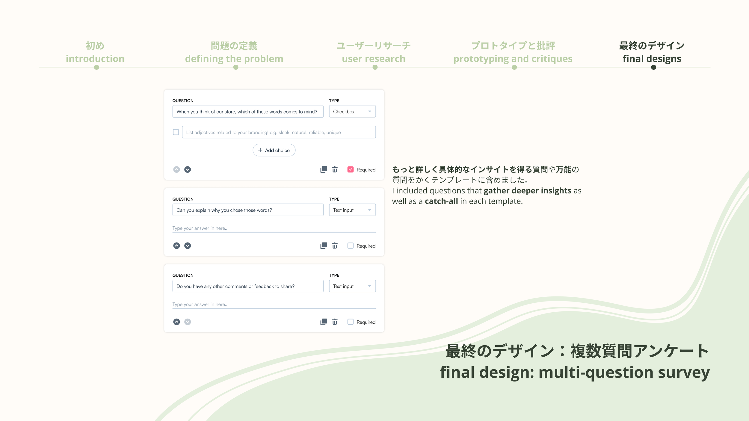
For the multi-question survey, I also added a demographic research template on top of all the template categories in the 1-click survey. When creating the questions and answers, I followed the insights of multiple-question surveys allowing you to dive deeper and get more specific insights by adding follow-up questions such as “can you explain why you chose [above answer]?.”
Finally, following the insight of the “catch-all” question, I included the question “Do you have any other comments or feedback to share?” to each survey. However, because this insight was mainly based on analogous research, I made sure to specify that this feature might benefit from AB testing and/or monitoring survey response rates in order to determine whether this extra question is actually beneficial.
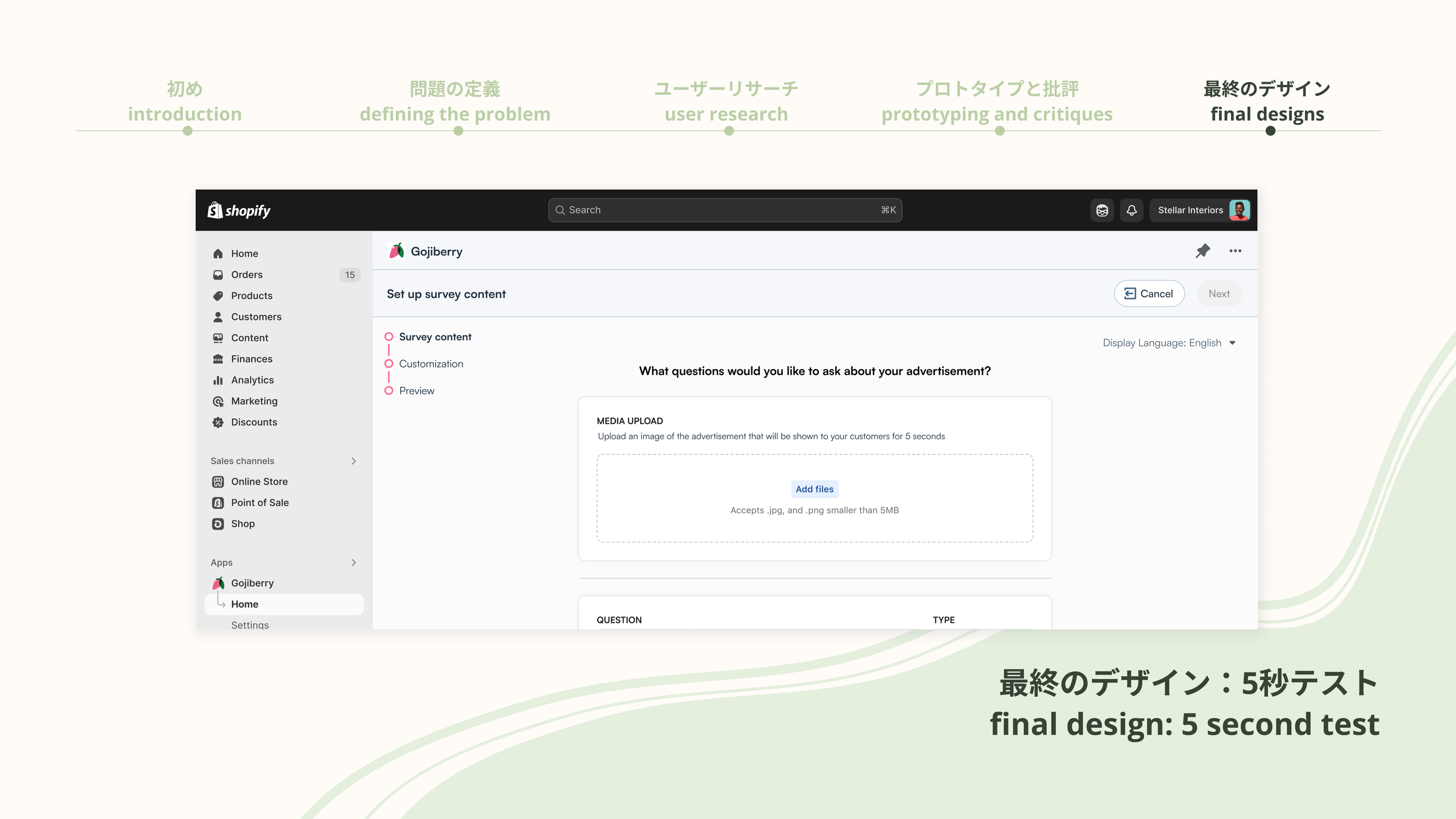
The 5-second test templates were the most difficult to create, as there was the least data on them. In general, we decided to work under the assumption that users were not utilizing the 5-second test because they were unsure of how to use it and how it would benefit their store. Because this assumption is not backed in user research, I tried to keep the changes to a minimum in order to most easily test the assumption without making the engineers do unnecessary work.
Based on analogous research and documentation, as well as consultation with the designers and the rest of the team, I created a new template page. Following the assumption that users didn’t know how to use the tool, I decided to make the categories features that could be tested with a 5-second test in order to immediately guide the user once they clicked on the tool.
I kept the content simple, only adding two of the most common questions that would also be easier for the user to analyze later, as well as the catch-all question from the other templates. I also slightly edited the prompts on each template page to match which category they chose to guide the user more.
Conclusion and Final Thoughts
Being able to lead this project and take it from start to finish was an amazing opportunity for me to practice each step of the design process. At first I was nervous to start the process without doing user research, but I realized that, given that the backend for the templates is already built out from the existing 1-click templates, implementing these changes would be relatively easy and simple, and it will be faster to push the changes to production and user test from there rather than spend time and money to confirm assumptions that are already fairly well backed by previous data.
These designs were implemented in July 2024, as detailed here. This project was also a great exercise in multidisciplinary team collaboration and agile development. See the full slide deck at the bottom of the page.


