PUSHCODE
reimagining the PUSHCODE notification creation system / PUSHCODEの配信作成システムを改善する
EDOCODE, 3 month project with a cross-functional team (9 people)

Overview
I worked closely with a team of designers, product managers, and engineers to redesign the user experience of creating push notifications on the PUSHCODE website in order to reduce friction and encourage users to convert to paid plans.
My Role
Designer, User Researcher
Skills
Qualitative user research
Miro
Components, design systems (Figma)
Agile project management (Pivotal Tracker)
Japanese
Teamwork
About PUSHCODE
PUSHCODE is a SaaS web push notification service that allows businesses to send push notifications to their users via PUSHCODE’s Push API.
PUSHCODE is a project in EDOCODE, a Japan-based startup with the goal to “leverage IT/web technologies to provide solutions to everyday inconveniences.”
The Problem
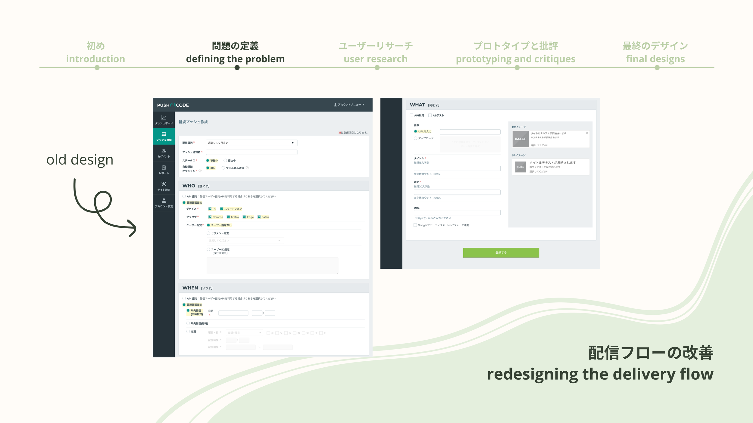
PUSHCODE’s revenue source is dependent on the number of notifications sent, so in order to increase the volume of notifications, the team decided to revamp their notification creation page in order to reduce friction and make it easier to create and send notifications.

Assumptions workshop
In order to better define what the focus of this redesign was, we first ran an assumptions workshop with the whole team. Together, we brainstormed, organized, and prioritized assumptions that would be tested in this redesign.


User Research
Based off of these assumptions, we decided to conduct a series of user interviews to gather more information about current push notification users. We created a two-part interview that included a question-answer section and a usability test in order to cover both issues with the current design as well as leave room for the discovery of new needs.
Because the pool of users within the PUSHCODE app was small, we weren’t able to get any interviewees from our own website, but we were able to interview 5 marketers who sent push notifications for their work. I opted to shadow them rather than run them myself since they were fully in Japanese.

Insights
After the interviews, we synthesized the information to find insights. Because the main focus was to redesign the push notification creation process, we focused on how to apply these insights to this specific task.

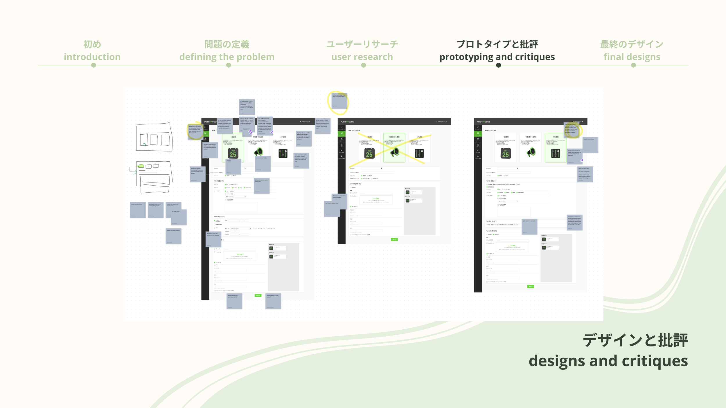
Prototyping and Critiques
I prototyped each page from lo-fi to mid-fi to hi-fi, with constant collaboration and feedback from both the other designers as well as the entire team. In the end, high fidelity wireframes were made using a design system.

Design Stories
After the final wireframes were approved by the team, I wrote design stories that described the layout and design of each page for the engineers to use as they developed them. By framing the design specifications from the viewpoint of a user persona, the entire team is able to better link the product to the user.

Walkthrough of Final Designs
From the user research, insights, prototypes, and critiques, several design changes and new features were made. All designs were created with the design system in mind.
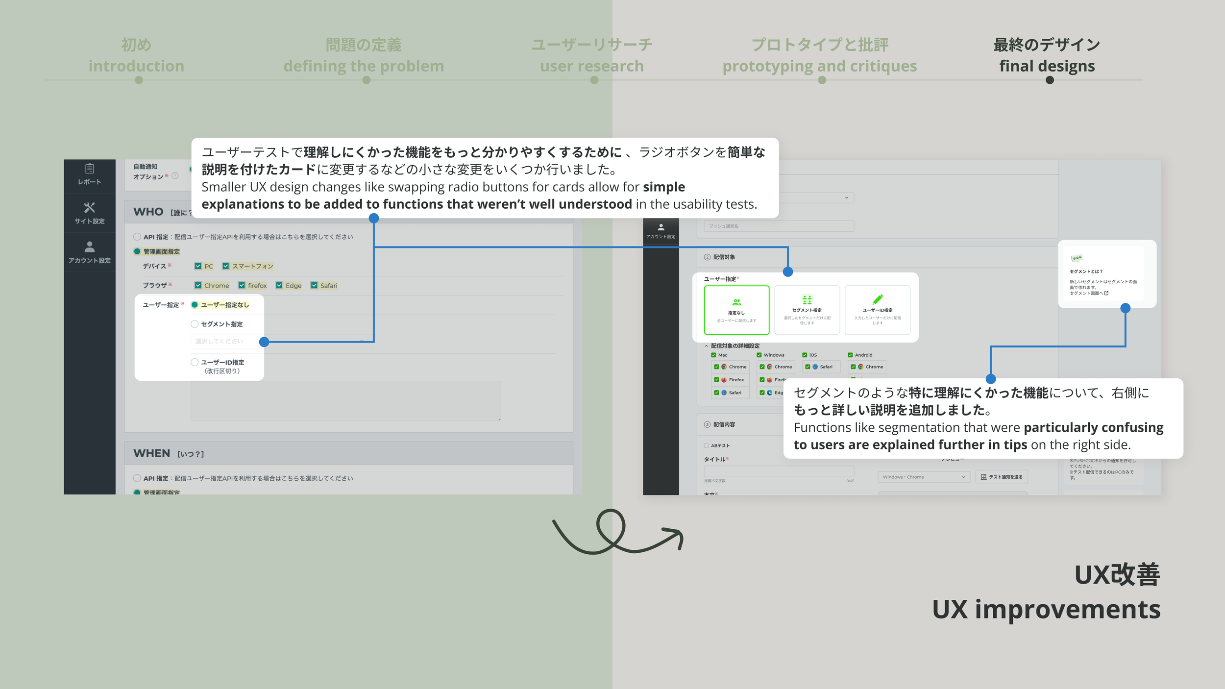
Firstly, I reworked the information architecture of the flow. One of the key learnings from the user research was that users didn’t know about/understand the different types of notifications available. From observing user interact with the website in user testing, we realized that this was most likely because functions that fundamentally change the notification types were mixed in with the regular settings. Because of this, these functions were mostly ignored.
In the new design, a new page was added to allow users to choose the type of notification at the beginning of the flow. By doing so, we were able to not only give more guidance and clarification on the different types of notifications, but we could also encourage the use of automatic notifications, which allow users to send more notifications with less effort.


Next, in order to address the insight that users want to prevent mistakes, we made two changes. First, I created new, more accurate previews for the notifications that allowed users to see exactly what they would be sending.

We also created a new “test notification” function. We worked closely with the PMs and engineers to figure out how the function would work, create a flow that would guide the user on how to use it, and cover any edge cases.


We also made several other small UI changes to make the experience flow better, such as replacing radio buttons with larger, more user-friendly buttons, hiding less-used settings in an advanced options tab to reduce clutter and decision-making, and adding tips and information on the right side to guide users through the process. See all changes in the final presentation slides at the bottom of the page or linked here.
Conclusion and Final Thoughts
PUSHCODE was deprioritized, so production stopped before these designs could be developed. However, being able to go through the process of making these designs helped me to gain invaluable experience in multidisciplinary team collaboration, design system utilization, and agile development. See the final presentation slides at the bottom of the page or linked here.